Introduction: In a move that underscores its commitment to evolving design principles, Google is set to refresh the icons of several of its applications. This transformation emphasizes a shift from the traditional flat design to a more dynamic, gradient aesthetic. This article explores the anticipated changes, focusing on their implications for the user experience as Google embraces modern design techniques, including rounded shapes and vibrant colors that resonate with the integration of artificial intelligence.
Revamping the Visual Identity of Google Apps
Google is embarking on a significant redesign of its app icons to better represent the increasingly prominent role of AI within its services. Previously, Google favored a strict color palette for its app icons, incorporating its signature blue, red, yellow, and green hues in a flat design. The new updates signify a shift towards more visually-engaging icons.
As part of this redesign, Google is adopting gradient color schemes and experimenting with the shapes and colors of its icons. For instance, the redesigned Gmail icon features a softer, rounded appearance.
Shifting from Sharp Edges to Rounded Shapes
The Google Tasks icon retains its blue and white color scheme but introduces a more delicate checkmark. Replacing the previous thick blue checkmark within double circles, the new design features a thin white checkmark inside a gradient blue disc.
Google Calendar is undergoing a substantial transformation as well, moving from a boxy design showcasing the current date in all four colors to an icon reminiscent of numbers on a classic digital flip clock, now depicted in blue with white numbers.
This approach mirrors skeuomorphism, a design style originally popularized by the first iPhone, where digital elements mimic their physical counterparts for intuitive user recognition.
Major Overhauls for Select App Icons
Significant updates are on the horizon for Google Meet, transitioning from a square video camera design in the four Google colors to a new yellow icon with rounded corners.
The Google Chat icon might see the largest transformation; shifting from a square speech bubble in Google's colors to a gradient green design resembling a traditional text bubble with a friendly smile.
Meanwhile, Google Keep, known for its light bulb icon, will keep this recognizable shape, but the design will become larger and feature a bright yellow and white bulb instead of the previous white bulb on a folded yellow background.
Subtle Changes for Other Icons
Google Voice will maintain its iconic phone handset, albeit with rounded edges and larger components for a fresher look.
Other minor updates include:
- Google Drive: The triangular shape remains, but the components will be more rounded, removing the red color.
- Google Docs: The design transitions from three lines on a folded paper to only two lines, simplifying the visual.
- Google Slides: A smaller rectangle on a yellow piece of paper will be replaced by a larger one, adjusted for a new layout.
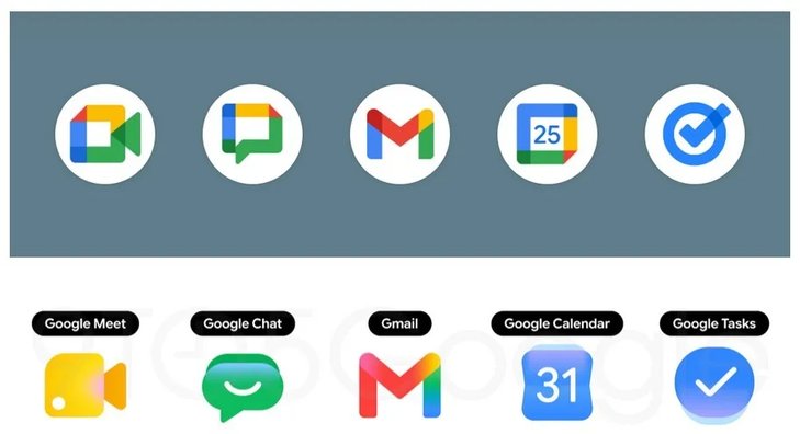
Below are some of the newly redesigned icons. | Image by 9to5Google
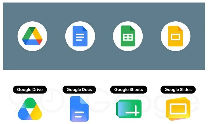
Some of the app icons undergoing minor modifications. | Image by 9to5Google
The timeline for these redesigned icons remains unclear, as they have yet to appear on the Pixel 6 Pro or the iPhone 15 Pro Max running the latest operating systems.